
Tuesday, September 20, 2011
Tuesday, September 13, 2011
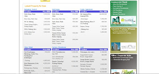
Redesign Commercial Website (Web Design 2)

This project is to re-design the website of ivory property to be more attractive.
Background:
Ivory property are a premier public listed property development group in Northern Malaysia with an outstanding and enviable track-record. All projects are completed with our signature focus on bold innovative designs, fresh lifestyle concepts, quality craftsmanship & workmanship, timely delivery and superior customer service. They have carved a strong niche and reputation in successfully reviving abandoned as well as hard-to-execute projects. Our vertically integrated range of in-house expertise includes architecture, engineering, construction, interior design and sales & marketing. This vertical integration enables us to control the construction process to ensure timely and quality delivery.
Good :
- The web looks elegance
- Composition very nice
- Color very nice
- Animation Advertising
Bad :
- Background color too plain
- Fonts in the green navigation bar can change to more out stand color
Competitor Website Analysis
The 1 Property


Sunway Property


Good :
- Nice composition
- Color not bad
- Price state quite detail
- Plain background
Bad :
- Title color not so nice
- Navigation bar flat
- Picture quite blur
- Too complicated
- Description too pack
I & P Group


Good :
- Easy to search houses
- Can be read
- Composition still ok
Bad :
- Logo and title design too simple
- Background lack of design
- Can be enhance to more interesting & attractive
Sunway Property


Good :
- The background is attractive
- Nice composition layout
- Nice navigation bar
- Info is clear
Bad :
- Title not stand out
- The property investment too many words
- Property investment background too blank
- The subtitle words a bit hard to read
IOI Group


Good :
- Color is nice
- Composition is nice
- Consistency style
- Background quite suite the mood
- The map for location is very special
Bad :
- lack of off music button
- background add some design to make it more interesting
Analysis Of Website
Harmony Residence, Penang

- Info easy to read
- Simple and plain design
- Main Color: white
- Comfortable style
Gurney Paragon, Penang

- Navigation bar too flat
- Web seems like cut into half
- Main Color: green,yellow & white
- Uncomfortable
- The Curve line looks not smooth
Sunway Property

- Info page clear
- Fonts stand out
- Main Color : Black & Red
- Background can change every time u log in
PDC Property

- Clear Info
- The purple color attractive
- Main Color: purple & white
- Plain background
Url Of Coding Tutorial
HTML
http://www.htmlcodetutorial.com/
http://www.w3schools.com/html/
http://www.quackit.com/html/tutorial/
http://www.tizag.com/htmlT/htmlcode.php
CSS
http://www.w3schools.com/css/
http://www.1keydata.com/css-tutorial/codes.php
http://www.csstutorial.net/css_misc_inserting.php
http://www.squidoo.com/css-codes
JAVASCRIPT
http://www.w3schools.com/js/
http://webteacher.com/javascript/
http://www.echoecho.com/jsbrowserdetection02.htm
http://www.relisoft.com/web/javascript.html
Url Of Design Tutorial
http://psd.tutsplus.com/tutorials/interface-tutorials/how-to-create-a-stunning-vista-inspired-menu/
http://designreviver.com/tutorials/create-a-nature-inspired-painted-background-in-photoshop
http://psd.tutsplus.com/tutorials/interface-tutorials/photoshop-web-design-sleek/
http://www.adobetutorialz.com/articles/2841/1/Professional-Modern-Web-Layout
http://webdesignerwall.com/tutorials/design-watercolor-effect-menu
Subscribe to:
Posts (Atom)